
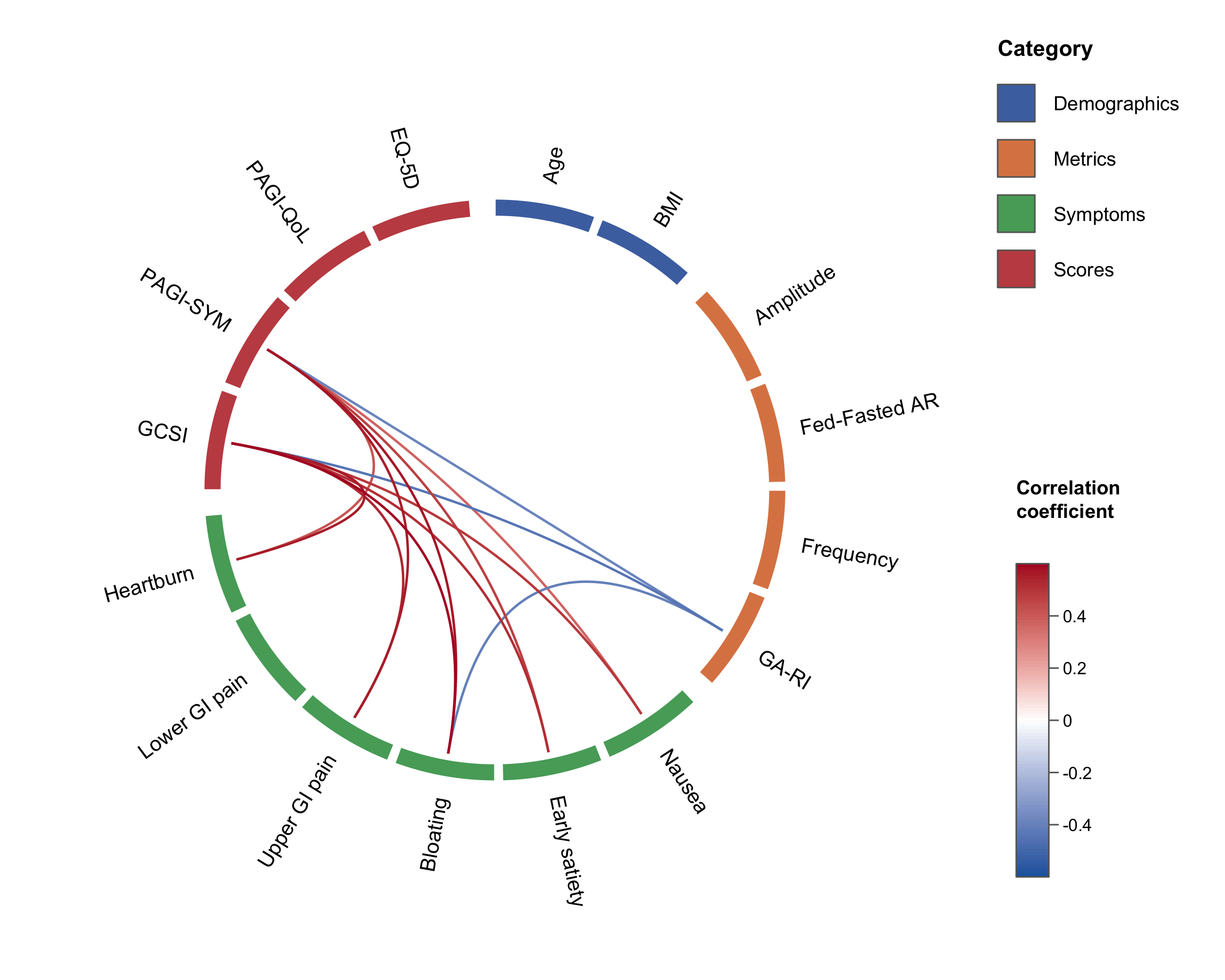
Circular correlation “wheel” plots in native R.
circlecorR draws correlation wheel
plots with variables arranged around a ring, grouped and colour-tiled by
category, connected by curved links whose colour maps to the correlation
coefficient using circlize.
A traditional correlation matrix is mostly redundant. A diagonal of
self-correlations, two mirror-image triangles, and blocks of
within-category correlations bury the between-category relationships we
care about. The wheel, first seen in Gharibans et al. (2019), keeps only
the relationships of interest. Hiding self- and within-category
correlations also removes them from the multiple-comparison
family, which improves statistical power (see
vignette("circlecorR")).
# install.packages("remotes")
remotes::install_github("kriz98/circlecorR", build_vignettes = TRUE)
(CRAN release pending.)
Dependencies (circlize and psych) install
automatically with the command above.
circlecorR is designed to work straight from a data
frame, one row per subject, one column per variable,
with no separate step to build correlation matrices yourself. Hand that
data frame to corr_wheel() and it computes the correlations
and p-values for you. The only other thing you supply is
groups, which both selects the variables and orders them
around the wheel (extra columns like IDs are ignored).
library(circlecorR)

# `gastro_symptoms` is a synthetic example dataset bundled with the package --
# swap it for your own data frame (one row per subject) to use your own data.
groups <- list(
  Demographics = c("Age", "BMI"),
  Metrics      = c("Amplitude", "Fed-Fasted AR", "Frequency", "GA-RI"),
  Symptoms     = c("Nausea", "Early satiety", "Bloating",
                   "Upper GI pain", "Lower GI pain", "Heartburn"),
  Scores       = c("GCSI", "PAGI-SYM", "PAGI-QoL", "EQ-5D")
)

corr_wheel(
  gastro_symptoms,          # one row per subject -- use your own data here
  groups      = groups,
  method      = "pearson",
  adjust      = "hochberg",
  sig_level   = 0.05,
  r_threshold = 0.3,
  r_limits    = c(-0.6, 0.6)
)png("correlation_wheel.png", width = 2400, height = 2000, res = 300)
corr_wheel(gastro_symptoms, groups = groups, r_threshold = 0.3, r_limits = c(-0.6, 0.6))
dev.off()See vignette("circlecorR") for the full tour.
Everything the reference figure controls is a plain argument:
| What | Argument | Example |
|---|---|---|
| Category assignment & order | groups |
named list or variable = category vector |
| Colour scheme (category colours + link palette, together) | scheme |
"colorblind", "ocean",
"vivid", "alimetry", or
list(colors=, palette=) |
| Category colours | colors |
c(Symptoms = "#55A868", Scores = "#C44E52") (overrides
scheme per category) |
| Pretty variable labels | labels |
c("GA-RI" = "Rhythm index") |
| Significance cutoff | sig_level |
0.05 |
| Multiple-comparison adjustment | adjust |
"holm", "hochberg", "BH",
"none" |
| Minimum |r| shown | r_threshold |
0.3 |
| Hide within-category links | hide_within_group |
TRUE / FALSE |
| Colour-scale range | r_limits |
c(-0.5, 0.5) |
| Link colour ramp | palette |
c("#2166AC", "white", "#B2182B") (overrides
scheme’s) |
| Block size (thickness) | tile_height |
0.06 (thin) … 0.12 (thick) |
| Line size (width) | link_lwd |
1.6, 3 |
| Rotation / spacing | start_degree, group_gap,
node_gap |
|
| Legend / colour bar | legend, colorbar |
Built-in schemes are listed with corr_wheel_schemes()
and inspected/tweaked with corr_wheel_scheme(); see
vignette("circlecorR") for examples.
corr_wheel() returns (invisibly) the ordered variables,
resolved group and colour maps, the colour function, and the masked
matrix actually plotted — handy for reproducibility or building a
caption.
gastro_symptoms is a bundled synthetic
dataset — fully simulated, not patient data — mimicking a
gastric-symptom study, one row per subject. It’s loaded automatically
with the package (LazyData: true), so it’s available
directly as soon as you library(circlecorR) — no
data() call needed. See ?gastro_symptoms for
details, or use it as a template for your own data’s shape.
A link between variables i and j is drawn only if all hold:
hide_within_group = TRUE), and never the same variable
(self-correlations are always excluded);p_adjusted <= sig_level; and|r| >= r_threshold.The correlations left after step 1 form the family
of comparisons. The adjust correction is applied over
only that family — so redundant self- and
within-category correlations don’t inflate the count, and power
improves. corr_wheel() returns n_tests (the
family size) and the family-adjusted p-matrix for reporting.
The correlation wheel was introduced in:
Gharibans AA, Coleman TP, Mousa H, Kunkel DC. Spatial patterns from high-resolution electrogastrography correlate with severity of symptoms in patients with functional dyspepsia and gastroparesis. Clin Gastroenterol Hepatol. 2019 Dec;17(13):2668–77.
It has since been used in several other gastric physiology studies: